“CSS allows you to create rules that specify how the content of an element should appear. For example, you can specify that the background of the page is cream, all paragraphs should appear in gray using the Arial typeface, or that all level one headings should be in a blue, italic, Times typeface.Once you have learned how to write a CSS rule, learning CSS mostly involves learning the different properties you can use.”
HTML and CSS : Design and Build Web Sites »
Writing your first CSS rule
CSS works by associating rules to specific HTML elements. These rules specify the presentation of the targeted HTML elements. Here is a CSS rule:
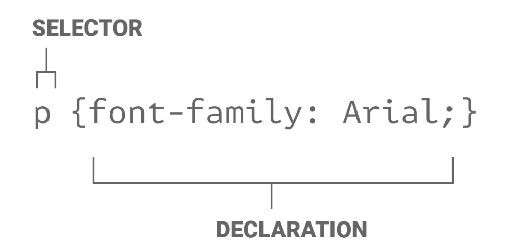
p {font-family: Arial;}This particular rule sets all text in paragraph elements to the font Arial. The selector, on the left, specifies which element a rule applies to, in this case, <p> tags. The declaration, in curly brackets, is a formula for presentation, the font family is equal to Arial.

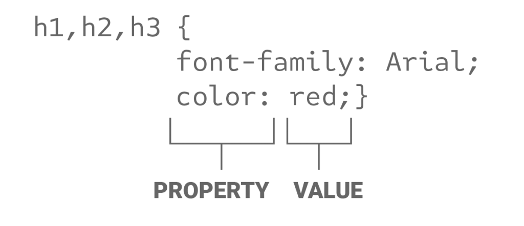
The rules for each selector can be made up from multiple declarations. Each declaration consists of a property – which is a presentation element that can be changed – and a value – which is the range of settings that can be applied.

In this video, we will use the anatomy of a CSS rule to start altering and manipulating the presentation of our HTML.
Feel free to use your own content while working along with these videos, or use this.
Here is a list of CSS properties to give you some idea to the extent of your control over HTML presentation.
CSS box model

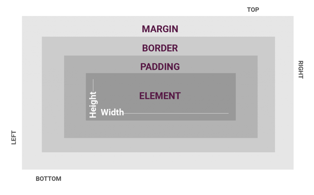
The box model consists of padding, borders, and margins wrapped around an HTML element. All HTML elements have these properties, even headings, and paragraphs.
For example:
p {
padding: 40px;
margin: 20px;
border: 2px solid black;
}
Classes and IDs
Classes and IDs make it possible to define your own selectors. This allows you to have multiple HTML elements with different presentation.
Using CSS to style anchor tags for buttons and links
Anchor tags are styled by default by web browsers. You may recognise the blue and underlined raw link. You will want to use CSS properties and values to design your own buttons and links. Anchor tags can also incorporate pseudo-classes to achieve rollover and active states. These are very useful for alerting users to the anchor function.
Web fonts for more interesting typography
In the past, we had to stick to system fonts for our web typography. This was mainly due to poor bandwidth. These days it is possible to use a much greater range of fonts as users’ internet connections are much higher speed. Services like Google Fonts and Adobe Fonts offer fonts that can be used across multiple platforms. This allows us a seamless design workflow, from mockup to screen.
The trick to using your own images with CodePen
Unfortunately, CodePen doesn’t allow us to use our own images unless we have a premium paid account. You can use images that are already published to the web and there are a few services that will host images for you. Postimages and cloudinary are potential options for image hosting.


