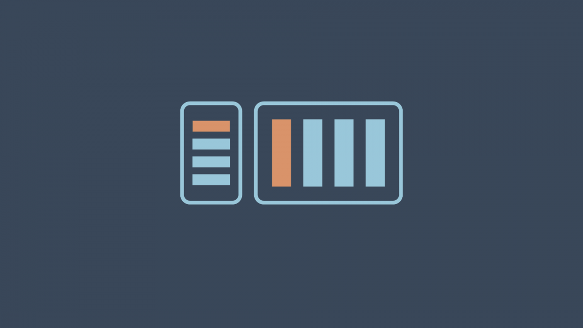
Media queries are useful when you want to modify your site or app depending on a device’s general type — such as print vs. screen — or specific characteristics and parameters — such as screen resolution or browser viewport width.
We write a media query like this:
@media (min-width: 600px) {/* CSS goes here */}Media queries are crucial in creating responsive web experiences. With media queries, we can apply different CSS to different devices and screen sizes. A media query checks for a condition and then applies CSS if that condition is met. In the above example, the media query is checking to see if the browser width is a minimum of 600px wide or more.
In this video, we look at how to implement a media query.
In the video below, we use a media query to change the layout of HTML elements based on the browser width.
Here is the completed CodePen for your reference.


