In this video, I’m adding the bells and whistles to my wireframe to transform it into a design that will inform my HTML and CSS.
Category: web
Different approaches to responsive images

Responsive images will automatically adjust to fit the size of the screen. This is important when we are designing websites or apps that adapt to the device or screen they are displayed on. These videos walk through some common approaches. While you are watching these videos, you should have a Codepen open so you can […]
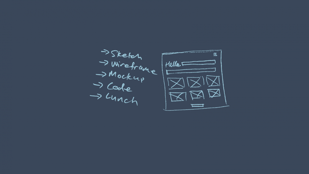
In this article, we are looking at the first steps to code a website with HTML and CSS. Hopefully, we can dispel some of the anxiety around getting started. As you will see, it isn’t that hard if you think through what you want to achieve. Plan the layout The best advice I can give about […]
Creating wireframe designs with Adobe XD
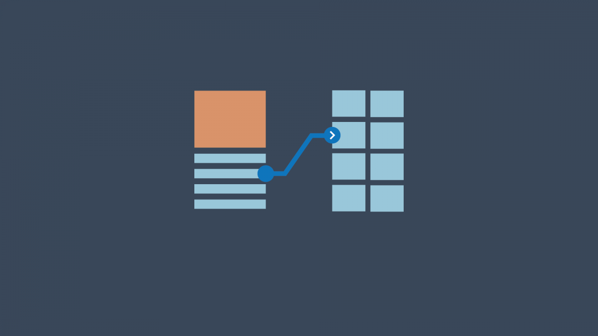
A wireframe is your blueprint design. It ensures that all design and usability problems are addressed before you go ahead and spend time on the high fidelity design work. In this three part video series, we will step through the process of building a mobile website wireframe in Adobe XD.
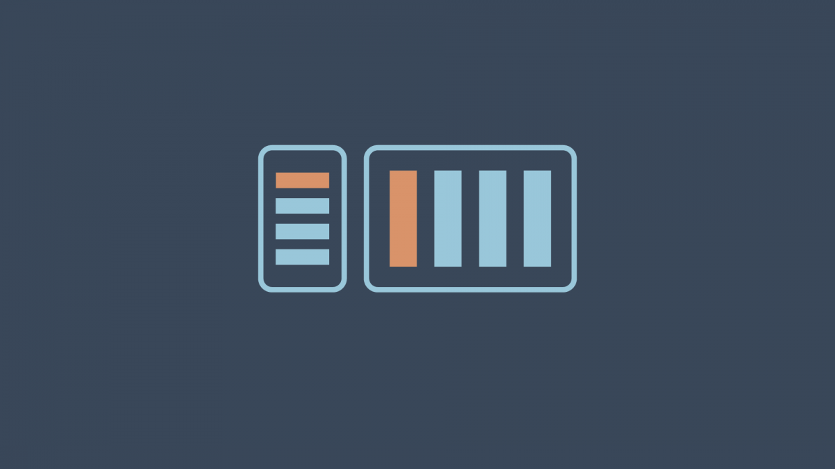
Media queries are useful when you want to modify your site or app depending on a device’s general type — such as print vs. screen — or specific characteristics and parameters — such as screen resolution or browser viewport width. We write a media query like this: Media queries are crucial in creating responsive web […]
Writing HTML and CSS in a text editor
In the demonstration below, we look at setting up a local HTML/CSS authoring environment. CodePen is excellent for experimenting, testing, and sharing work, but at times we will need to develop our files on our own local hard drives. File management is important when working locally. You’ll need to make sure you are clear about […]
Flexbox is a CSS layout module. Flexbox allows elements in a container to be responsively arranged depending on the size of the container. Flexbox gives a container the ability to alter its items dimensions in order to best fit in the available space. A container with flexbox applied can expand or shrink its child items […]
XD is an integrated tool for the user interface (UI) and user experience (UX) design process. You can create flowcharts, wireframes, mock-ups, interactive prototypes, and animations – all in the one design space.
Updated 25/3/2021 CodePen is fantastic for testing and experimenting with HTML and CSS. It is also great for documenting and sharing your work. At some stage though, you will want to move that work to a local environment to continue your development. By ‘local environment’, I mean your own computer. You will want to download […]
The position property allows you to specify position values for an element. You can move an element around the page in relation to the document or parent elements. You can take an element completely out of the HTML flow and fix it permanently in one position. There are a number of values you can assign […]

