Categories
web

The importance of including the Viewport meta tag in you HTML pages

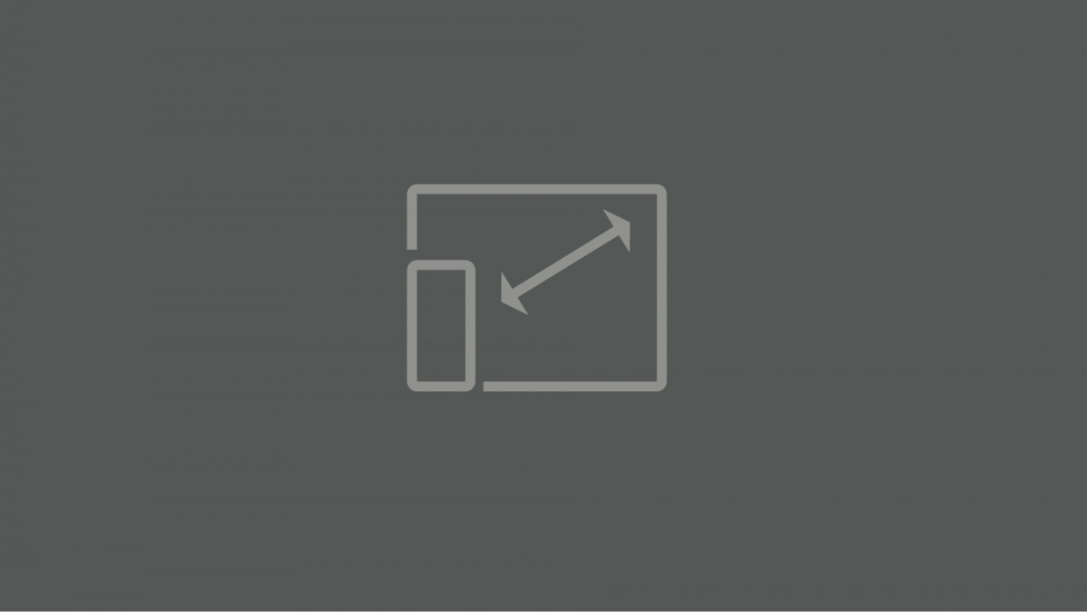
The viewport is your user’s view of your web design. Your user’s viewport will be different depending on what kind of device they are using. It might be a small Android smartphone or an iPhone 12 pro. They might be using Firefox on a desktop computer. As responsive web designers, we design for all of […]

Categories
web

Making buttons and navigational elements with :hover

The :hover selector is used to select elements when you mouse over them. The :hover selector can be used on all elements, not only on links. Use the :link selector to style links to unvisited pages, the :visited selector to style links to visited pages, and the :active selector to style the active link. Make […]

Categories
web

Design and code a simple website – from go to whoa – Part 2

In part 1 of this article, we discussed the planning stages of a web design project. In this part, we will jump in and implement that planning with code. Let’s start writing some HTML. Open up a CodePen and follow along with the screencasts below. Good luck. Getting the main structure in place In this […]

Categories
web

Different approaches to responsive images

Responsive images will automatically adjust to fit the size of the screen. This is important when we are designing websites or apps that adapt to the device or screen they are displayed on.  These videos walk through some common approaches. While you are watching these videos, you should have a Codepen open so you can […]

Categories
web

How to use media queries to make responsive CSS designs

Media queries are useful when you want to modify your site or app depending on a device’s general type — such as print vs. screen — or specific characteristics and parameters — such as screen resolution or browser viewport width. We write a media query like this: Media queries are crucial in creating responsive web […]